Resume Templates
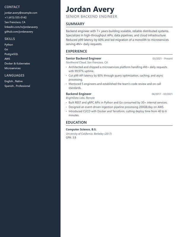
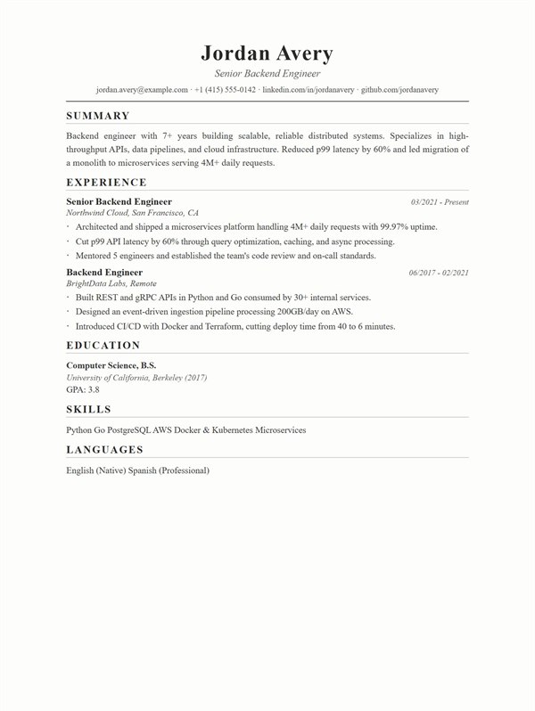
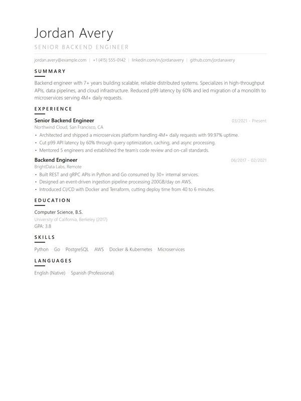
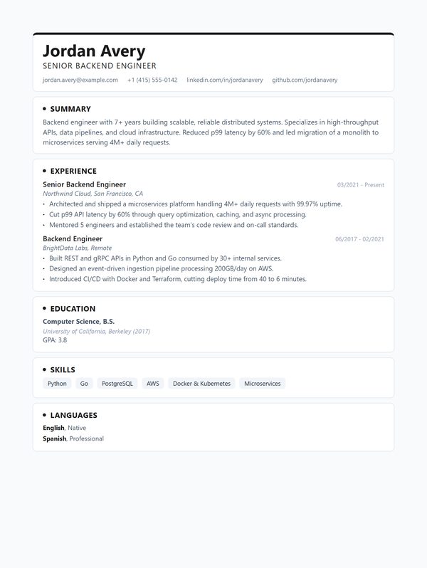
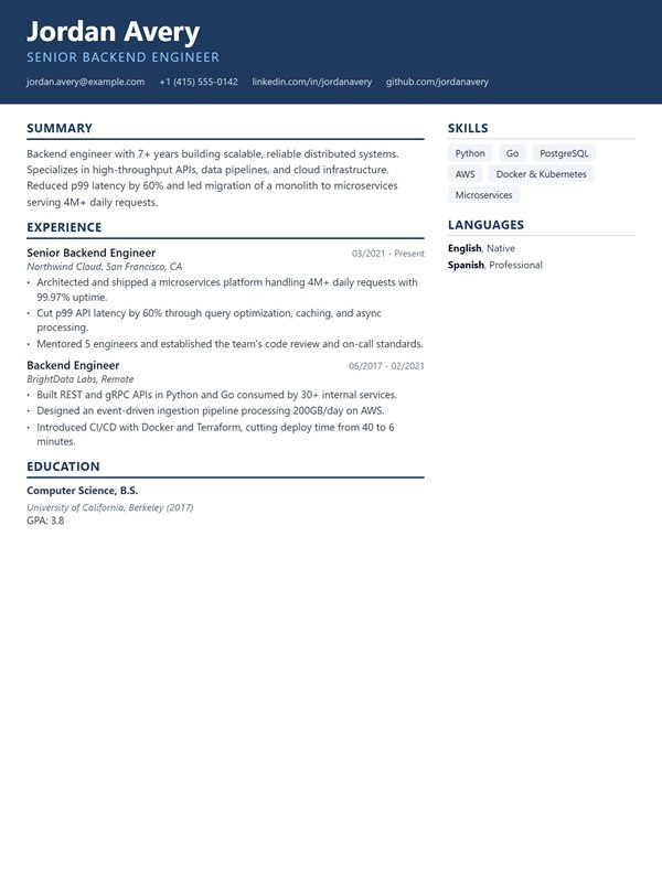
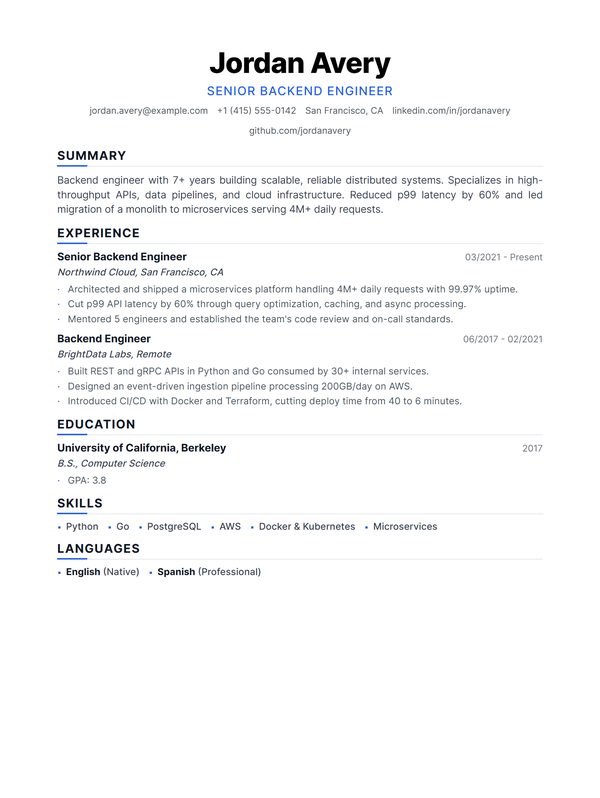
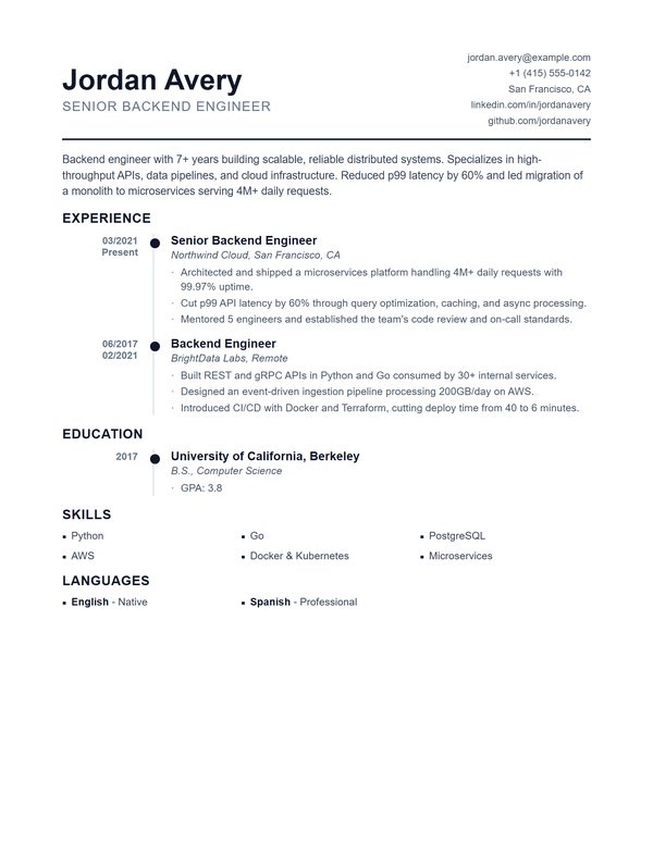
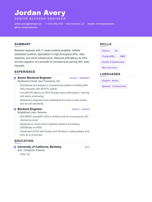
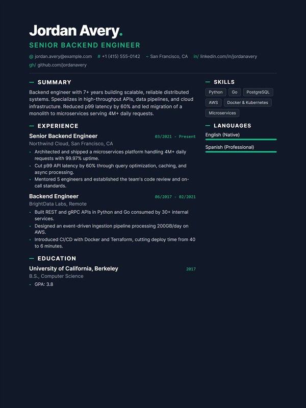
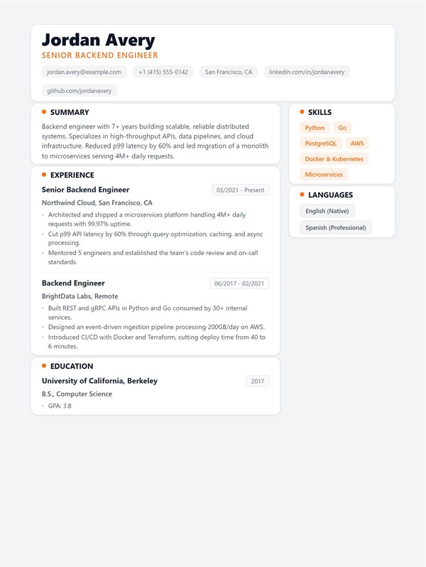
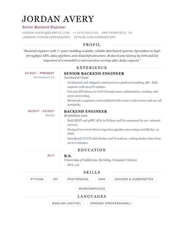
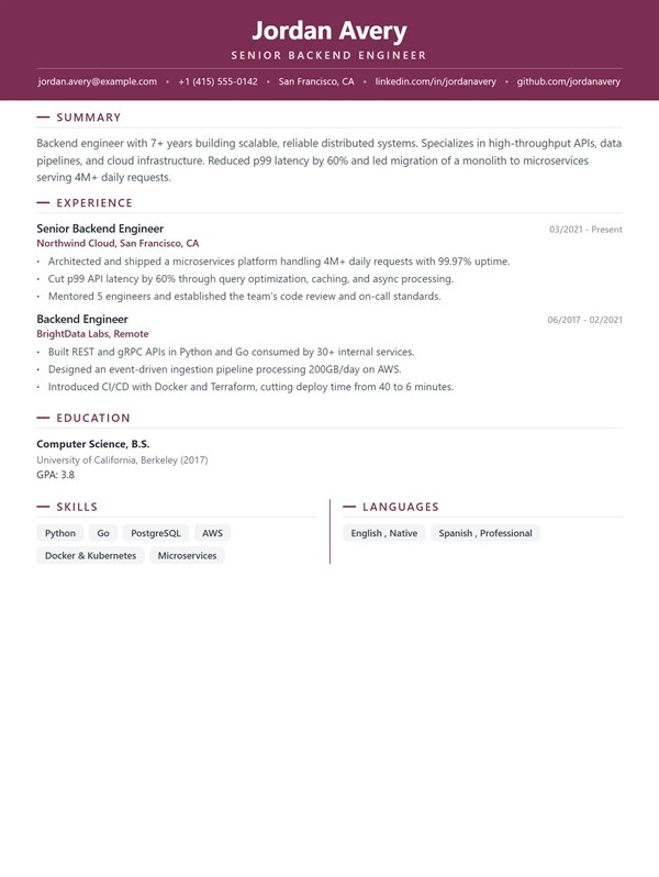
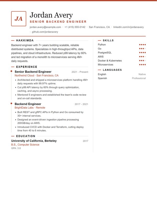
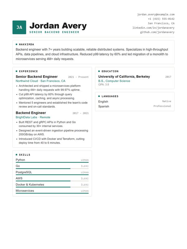
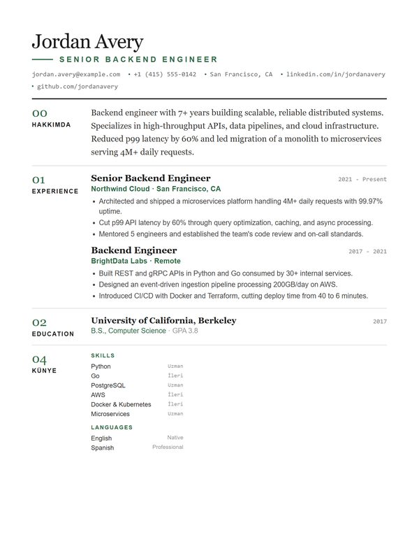
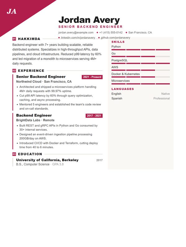
Twenty five layouts, three of them free to use and download. Every preview below is the same CV rendered in a different template, so what you are comparing is the design, not the writing.
All 25 templates
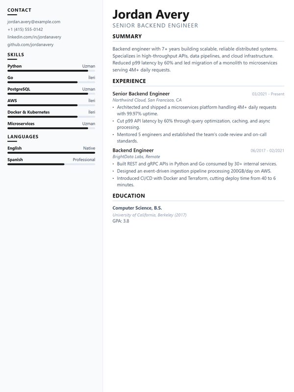
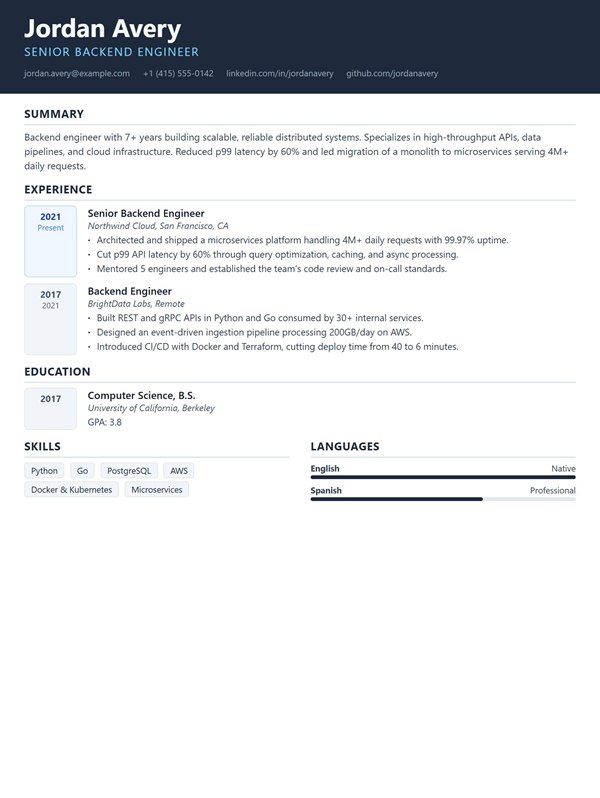
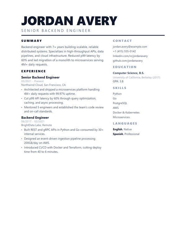
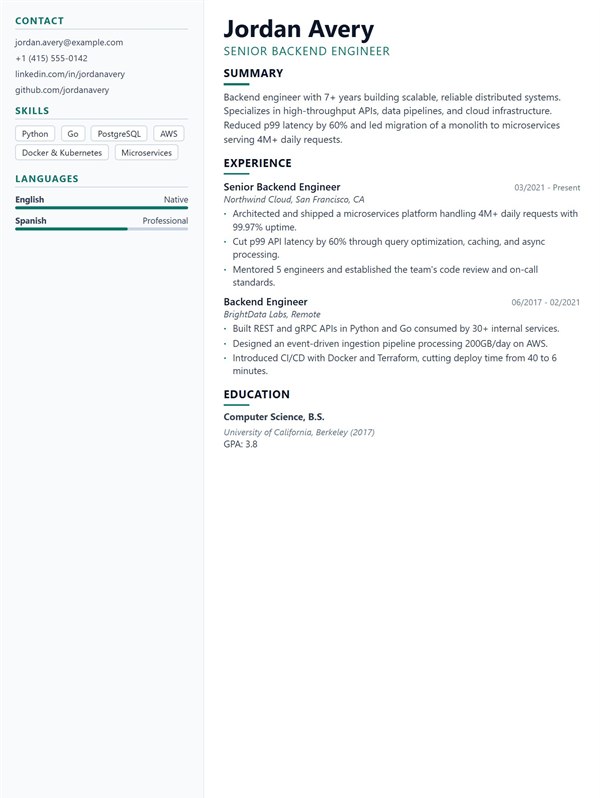
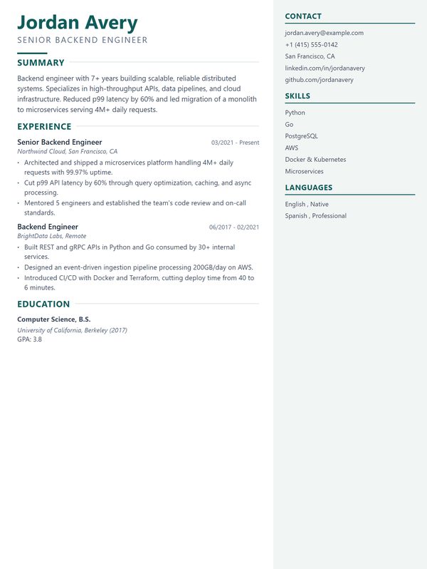
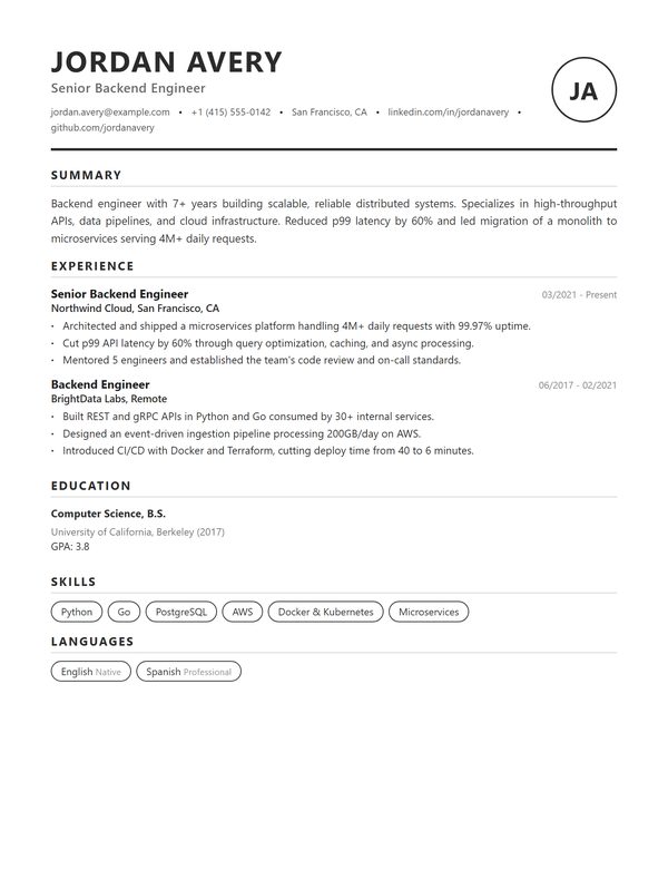
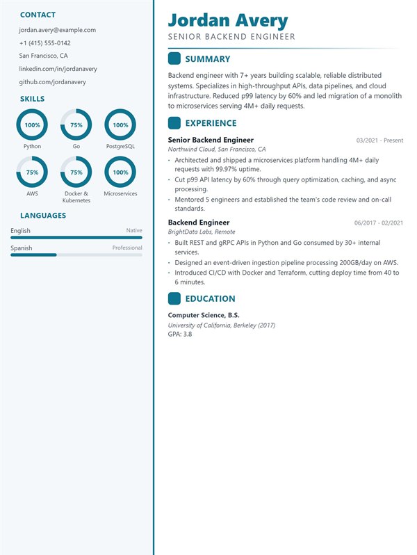
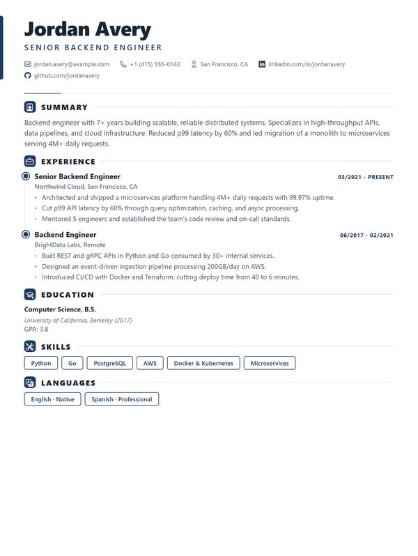
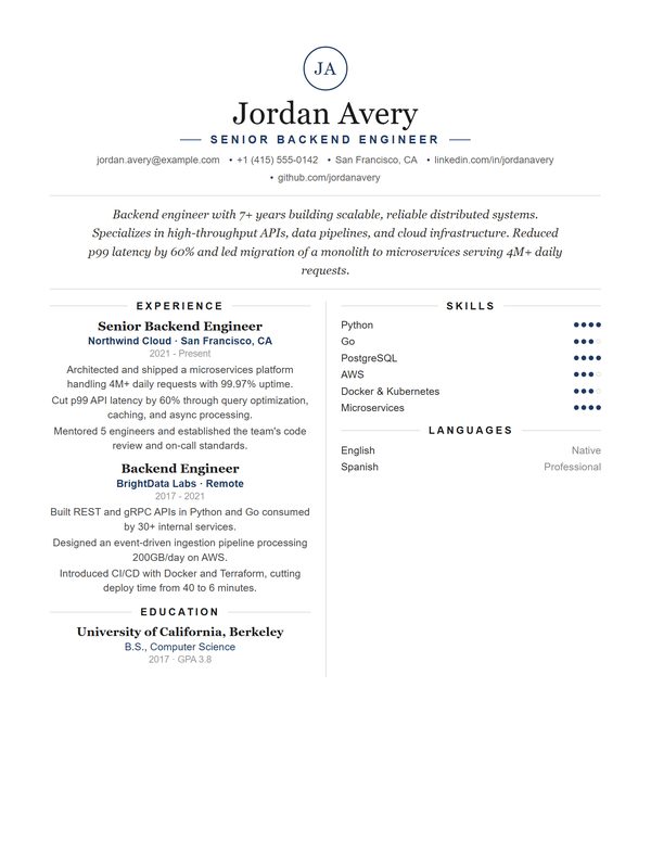
Each preview shows the same example CV, a backend engineer with two roles and one degree, so you can compare layouts fairly. Your own content will change the spacing.
What a template can and cannot do for an ATS
An applicant tracking system is a database that recruiters search, not a gatekeeper that scores your design. When a CV goes in, the system tries to pull out structured fields: your name, your employers, your dates, your job titles, your skills. A template affects that extraction step, and nothing else.
What breaks extraction is a small, boring list. Text stored inside an image, because there is nothing to read. Contact details parked in the header or footer area of the page, which some parsers skip entirely. Multi column layouts where the reading order jumps between columns mid sentence. Section headings invented from scratch, so the parser cannot tell where experience ends and education begins. Tables used to force alignment, which can collapse into one long line.
Every template on this page renders as real, selectable text with standard section headings, and none of them put your contact details in a page header. That is the part a template is responsible for. The rest is your content, and no layout rescues a CV that never says what you actually did.
How to choose, in the order that matters
Start with how much you have to say. If you have ten years across four employers, a dense single column layout gives you room without shrinking the type to an unreadable size. If you are a student or a career changer with one short role, a design with more whitespace and a visible skills block stops the page from looking empty.
Then think about who reads it. Conservative fields such as law, accounting, healthcare and the public sector reward a plain, familiar structure; a heavy accent colour reads as noise there. Design, marketing and product teams are used to more character, and a template that shows some restraint still looks considered. If you are unsure, plain wins more often than bold.
Only then pick the one you like. Between two templates that both fit your content and your field, the difference in outcome is close to zero, and the time is better spent on the bullet points.
Photo or no photo depends on the country
Every template here works with and without a photo, because the right answer is regional. In Germany, Austria, Turkey and much of continental Europe a photo is still expected on a standard CV. In the United States, the United Kingdom, Canada, Ireland and Australia it is usually left off, partly because employers avoid anything that could support a discrimination claim.
If you are applying across borders, follow the norm of the country the job is in, not the country you are in. Leave the photo out when you cannot tell.
Free and Pro, plainly
Three templates are free with no account limits: Stanford, Cambridge and Oxford. You can build, edit and download a complete CV in any of them, and they are not crippled versions. They are the three plainest designs, which is also why they suit the widest range of applications.
The other twenty two need a paid plan. The reason is not that they unlock a hidden feature, it is that they are the part of the product people upgrade for. What each plan includes, and what the monthly AI allowances are, is set out on the pricing page.
Common questions
Are these templates really ATS friendly?
They render as selectable text with standard headings and keep contact details out of the page header, which is what parsing depends on. No template can promise a result beyond that, because the rest of the outcome comes from your content matching the job.
Can I switch templates after I have written my CV?
Yes. Your content is stored separately from the layout, so you can move between all twenty five without retyping anything. Spacing changes, wording does not.
Which template should I use if I have almost no experience?
One of the plainer single column designs, with your education and skills near the top. A busy layout draws attention to how little is on the page. There is a full guide to writing a CV with no work experience on the blog.
Do I get a PDF or a Word file?
A PDF, generated from the same layout you see in the preview. PDF is the safer choice for applications: it keeps the design intact, and modern parsers read text based PDFs without trouble.
Is a two column CV a bad idea?
Not by itself. The problem is a layout where the reading order jumps between columns inside a section. The two column templates here keep each section whole, so a parser reads them in order.
How many pages should my CV be?
One page is a good target early in a career, two is normal once you have several roles worth describing. Academic and research CVs are the exception and are expected to run longer.